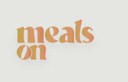
ON is a state. ON is a beginning.
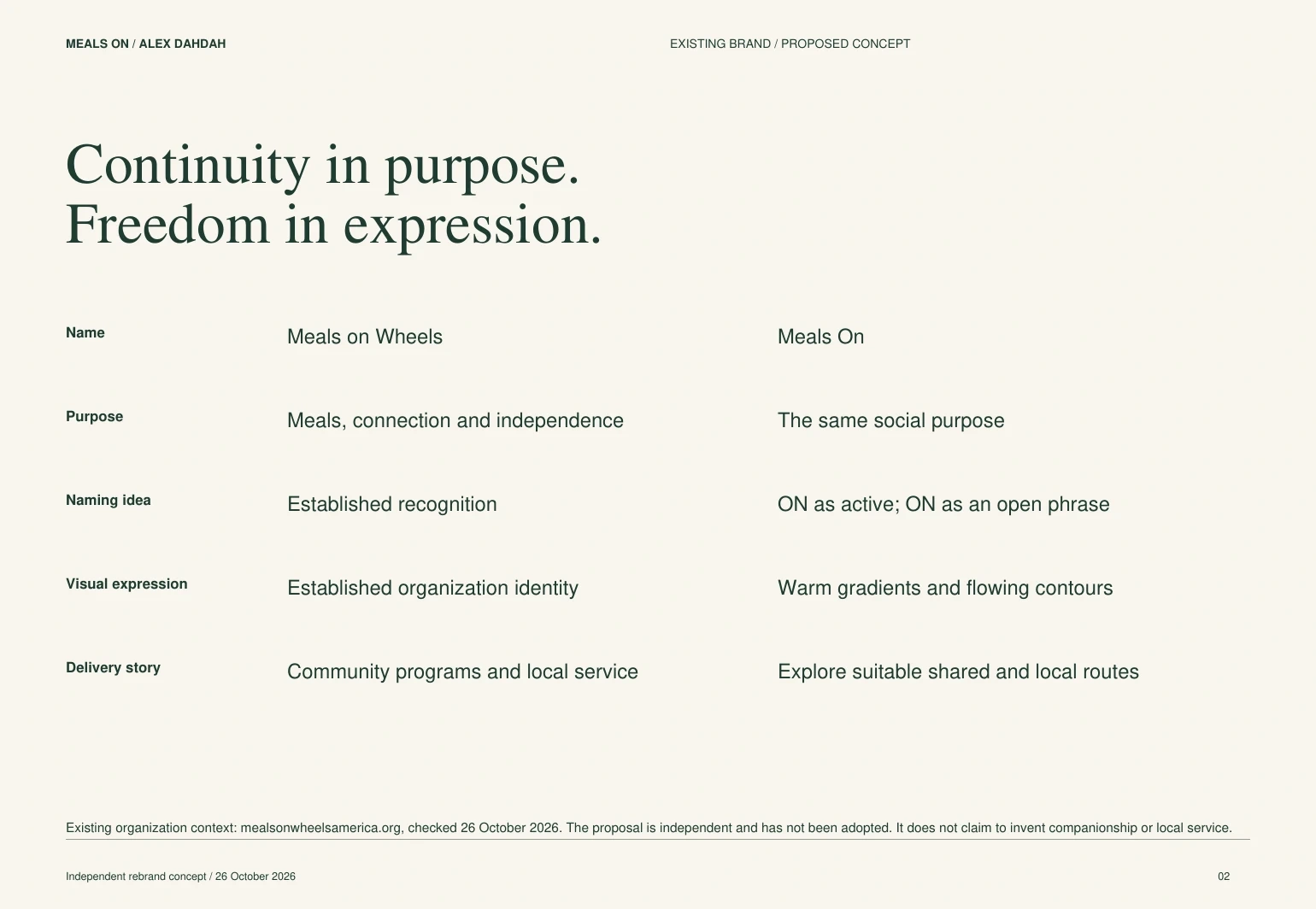
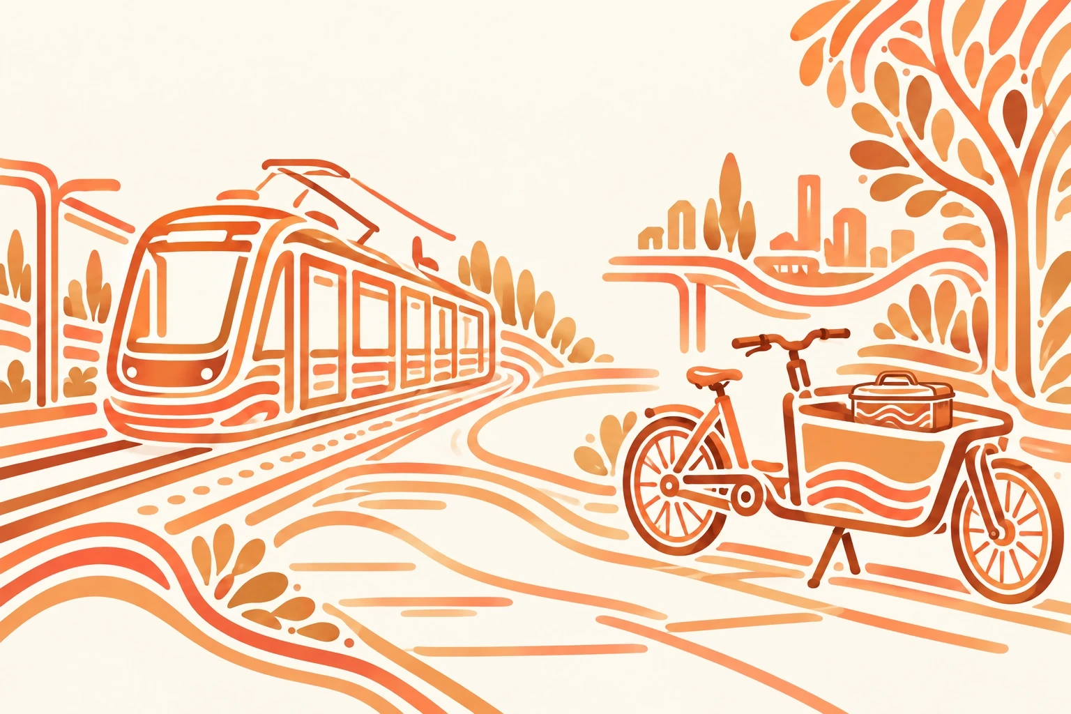
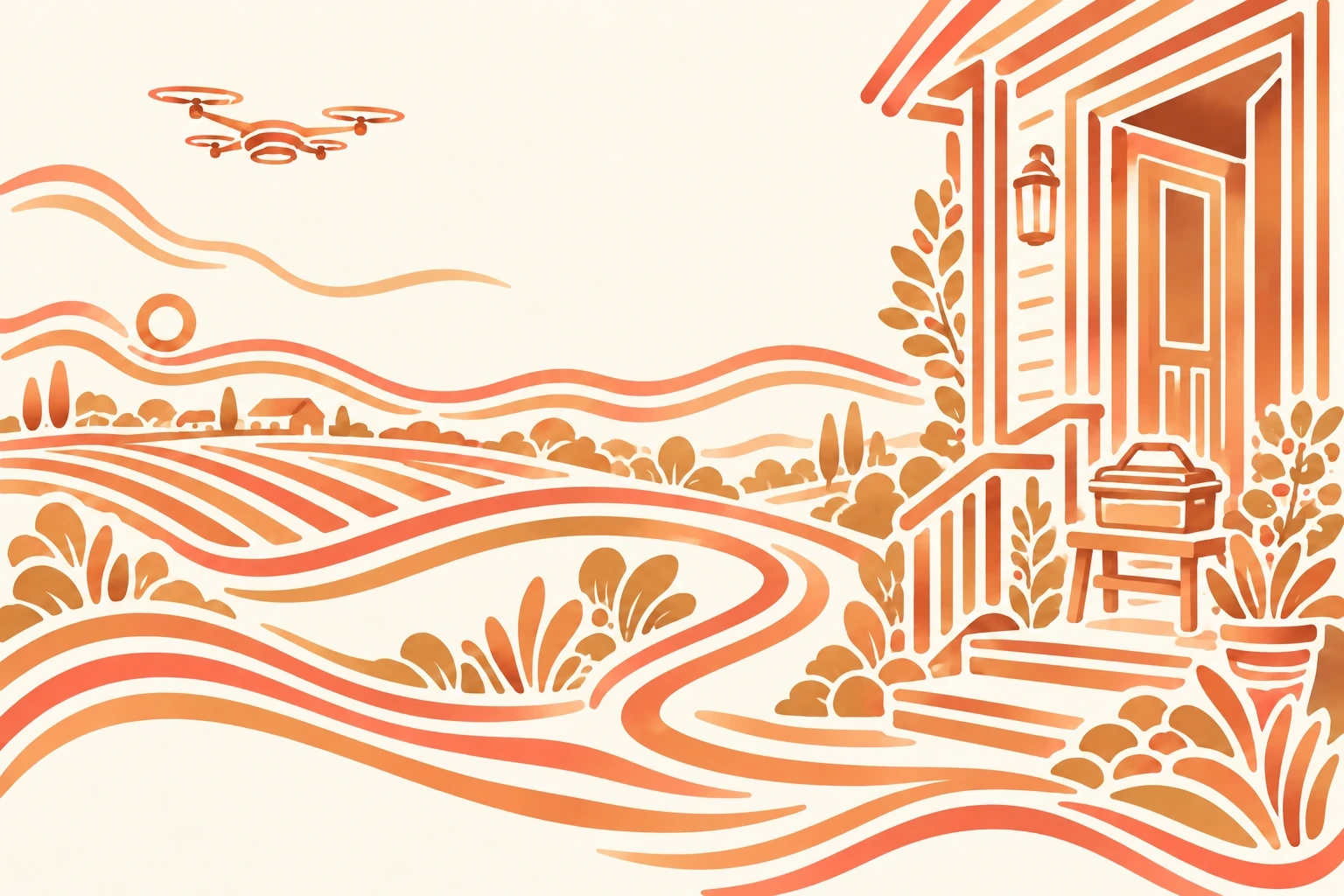
Meals On begins with a small change to a familiar name. Removing Wheels makes ON do two things: it signals an active, continuing service, and it opens the phrase to different ways of reaching people. MealsOn Wheels. MealsOn Air. MealsOn the Train Tracks.
The everyday identity remains Meals On. The changing endings belong to specific stories and applications; they do not have to accompany every appearance of the logo.
The purpose stays personal
Meals on Wheels already stands for more than food, including connection and independence. This independent proposal carries that purpose forward. It asks how the name and identity could accommodate a broader delivery network while keeping the person receiving the meal at its center.
This is a course-originated design proposal, not an adopted rebrand. Rail, cycle and air scenarios are possibilities for investigation, not documented services.
A line that connects the system
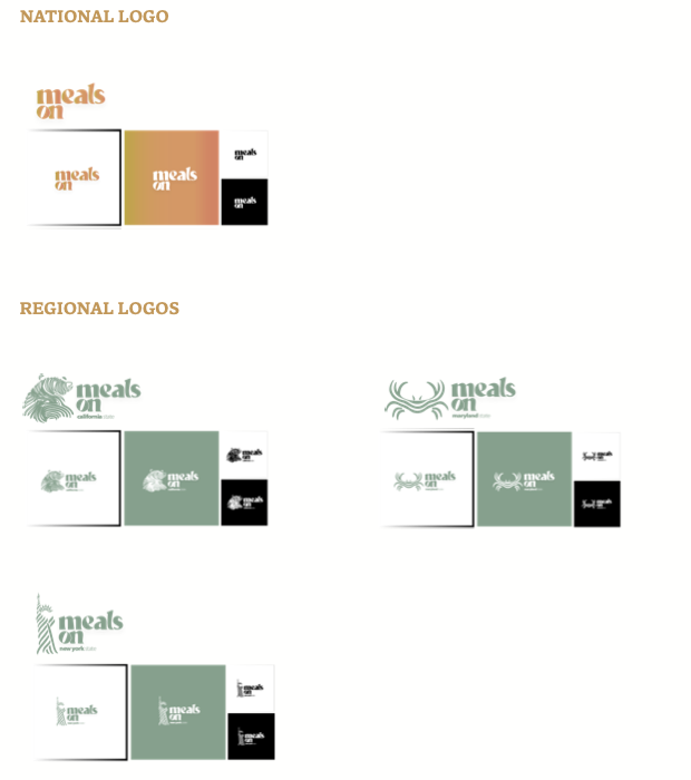
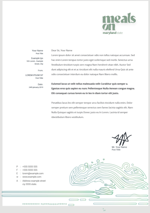
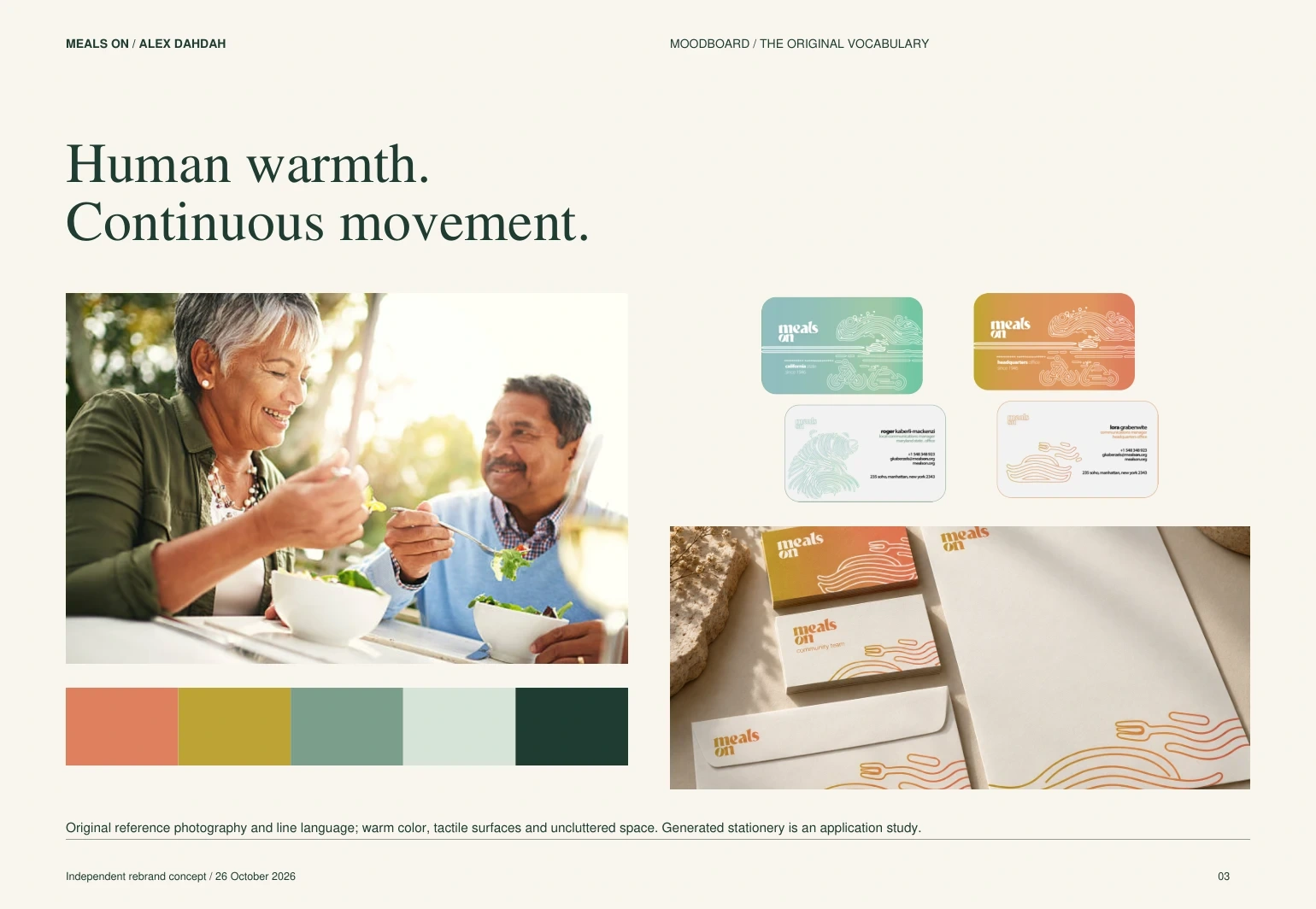
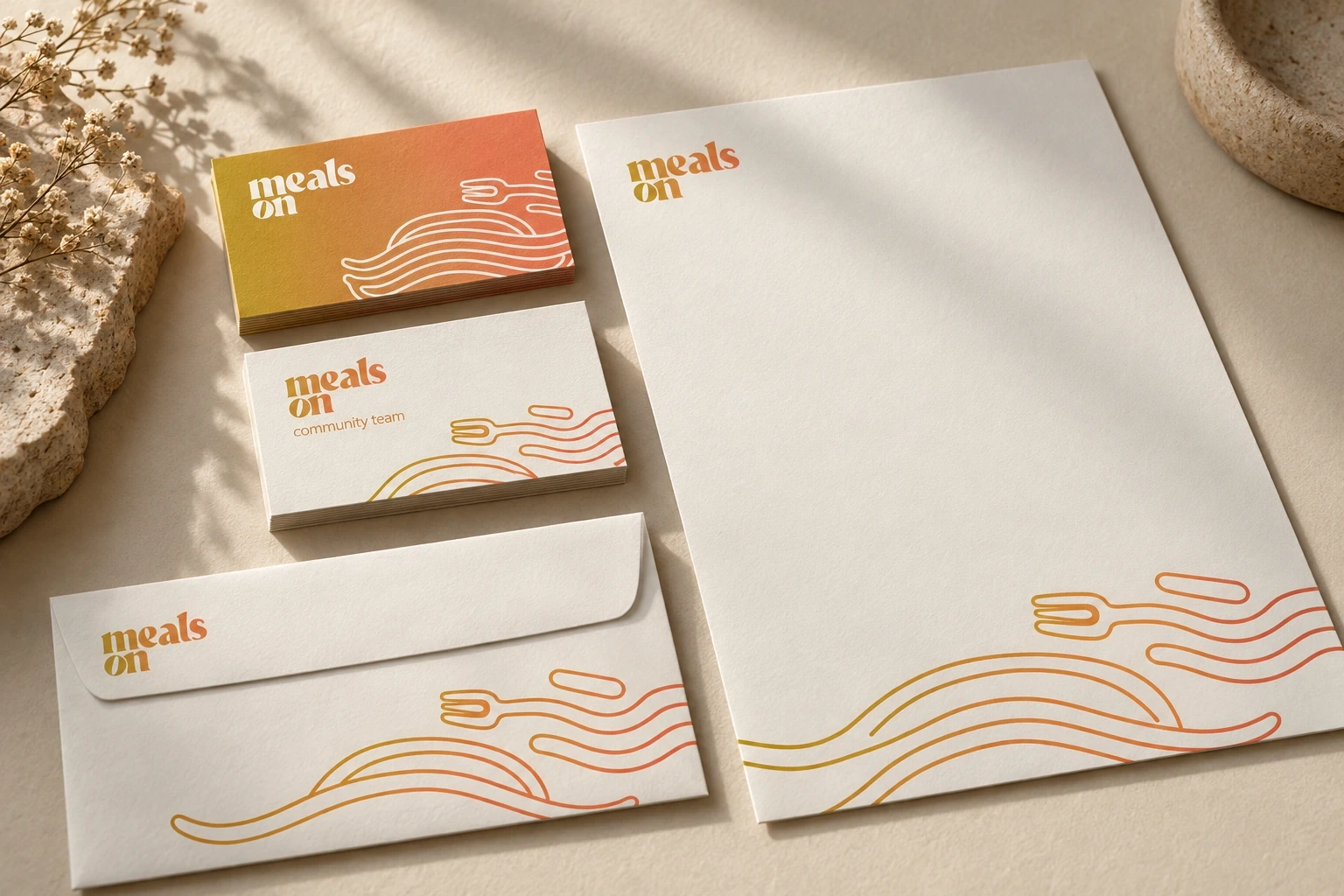
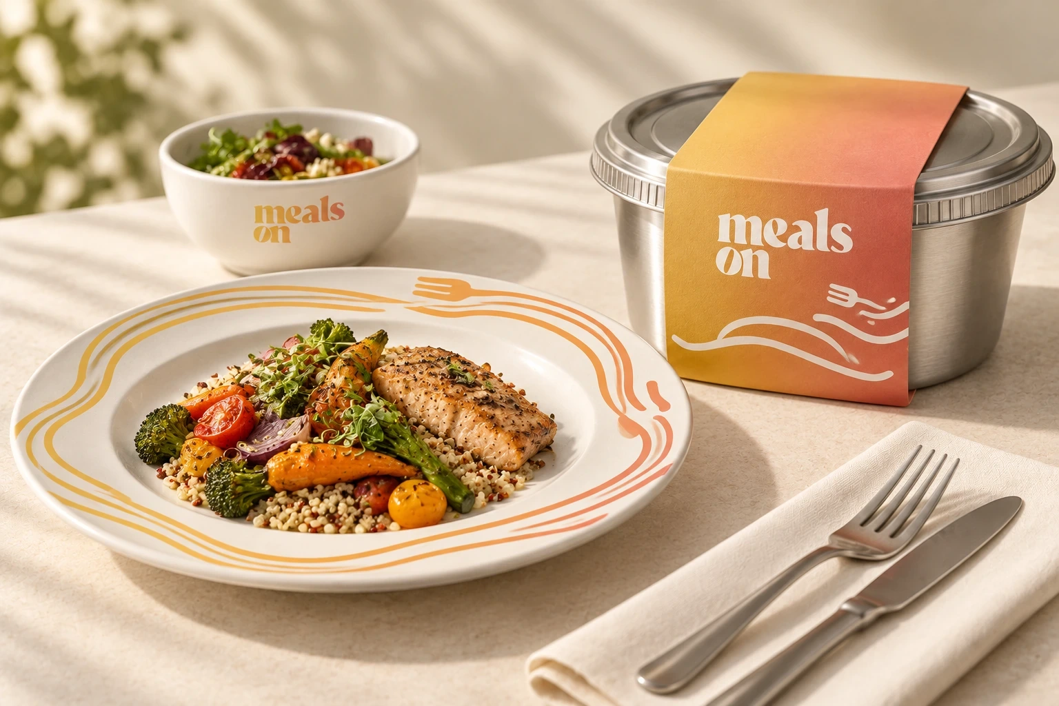
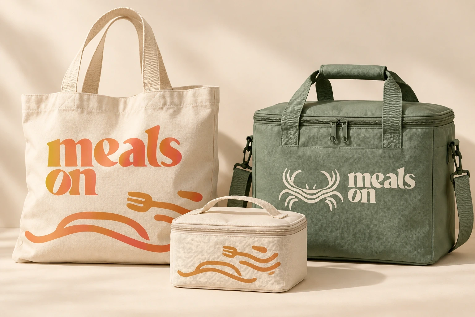
Flowing contours form food, transport and regional symbols. The same visual rhythm moves from the logo family to stationery, containers, bags and the website. People remain photographic: the illustrative treatment belongs to the objects and places around them.
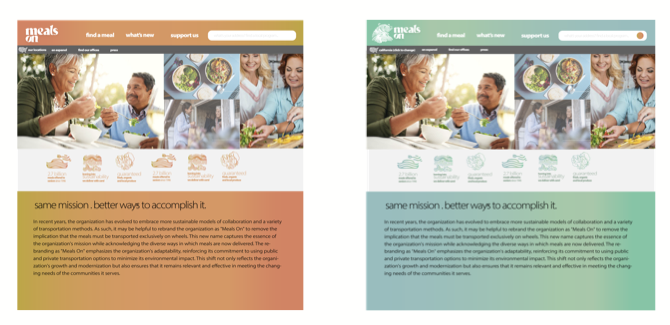
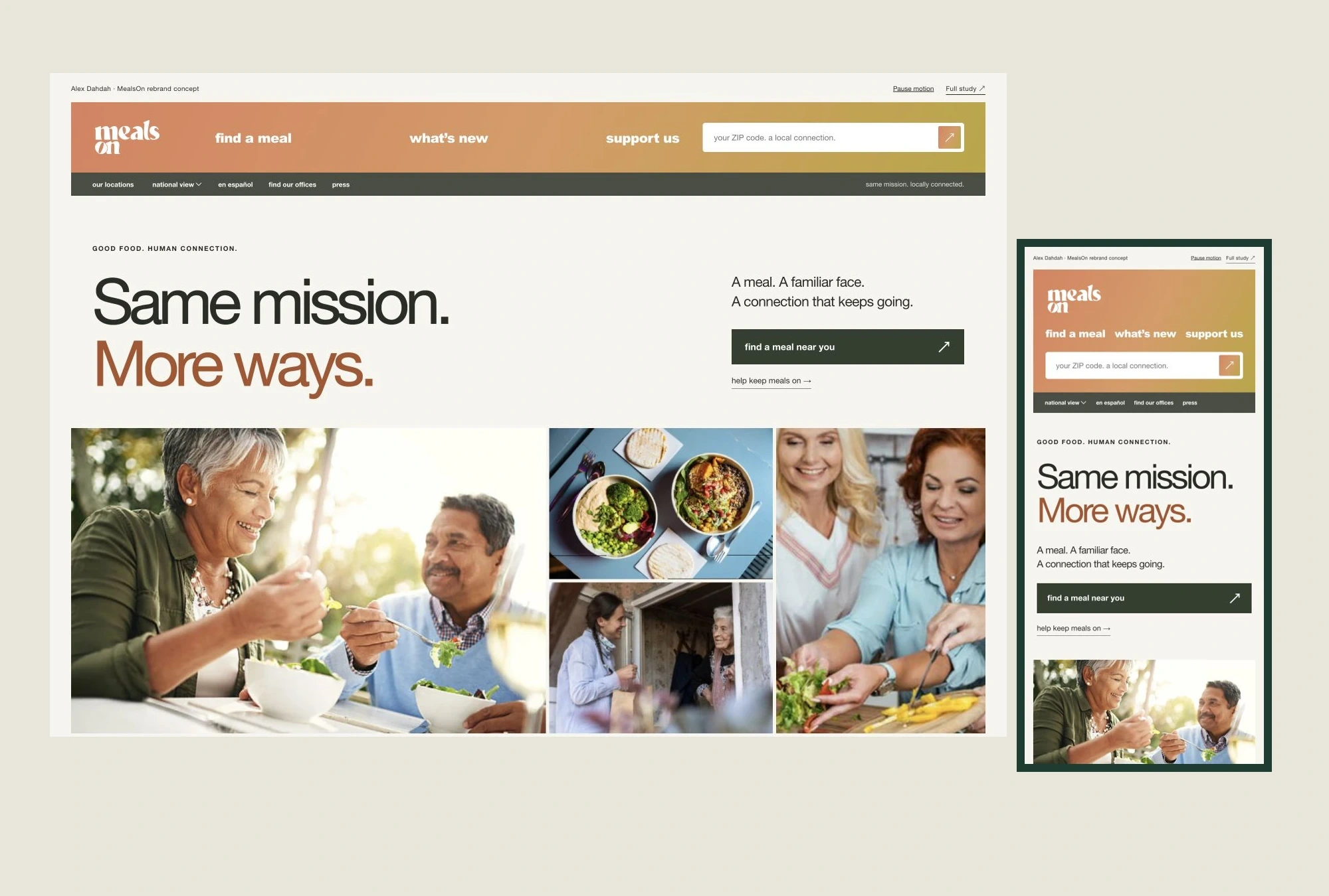
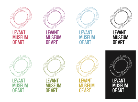
Ochre-to-coral gradients give the national identity warmth. Sage and mint support regional expressions. The refined website builds on the original photographic mosaic and navigation, with calmer spacing, clearer hierarchy and restrained animation.
The environmental proposition
More modes do not automatically mean a smaller footprint. The proposal invites a route-by-route evaluation of shared travel, local handoffs and reusable packaging. Return trips, washing, failed deliveries, energy and actual reuse all belong in that comparison.
No environmental savings have been measured for this concept. The human visit remains part of what the service should protect.
Original work and new applications
The original identity was developed by Alex Dahdah for MICA’s Visual Identity Systems course. The 2026 extension develops its naming idea, motion, website and application family.
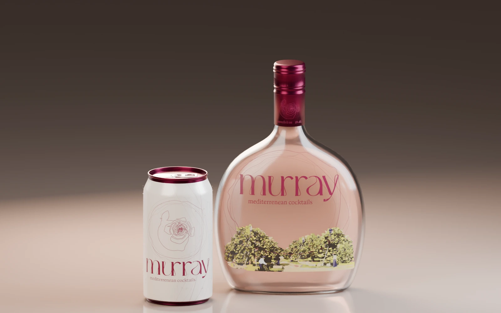
Business-card, tableware and bag scenes are AI-generated concept mockups. Website renders are captures of the working design prototype. Original vector drawings govern exact logo and illustration production.