Role
Visual identity & motion

Original FIXABL social cover with white lettering over an orange-to-indigo gradient
Source: Original FIXABL identity
Visual identity and applications for FIXABL, a home-service business in Richmond, Virginia. A lowercase wordmark, with its distinctive f and four-part x, connects a compact fxbl signature, orange and indigo, and three service graphics: fix it, connect it and light it. The system extends across business cards, social graphics and application studies, with later motion carrying the original lettering into digital settings.
Visual identity & motion
A direct, approachable identity for work around the home.
The lowercase wordmark gives FIXABL an informal voice. Its distinctive f and four-part x hold the name together, while the compact fxbl signature carries the same character into smaller spaces.
Solid and outlined versions give the mark different weights without losing its shape. The original guide pairs Myriad Variable Concept with lowercase lettering, keeping the wider identity close to the wordmark.


Orange brings warmth and visibility; indigo gives the lettering a steady ground. Both colors meet in the original gradient social graphics.
Three short phrases connect the services to recognizable symbols: crossed tools, a connected home and a lamp.



Later digital extensions stay close to the original drawing.

The X turns into place. The f slides outward, and the remaining letters resolve into the complete wordmark. The animation at the top of this page uses the original lettering, then holds the full mark before repeating.
The same X becomes a compact favicon. The richer fxbl signature remains available when there is room for more of the name.
Return to the animation ↑The motion and favicon were developed in 2026. The new client website remains an unpublished preview.
From a business card and social cover to garments, magnets and signs.
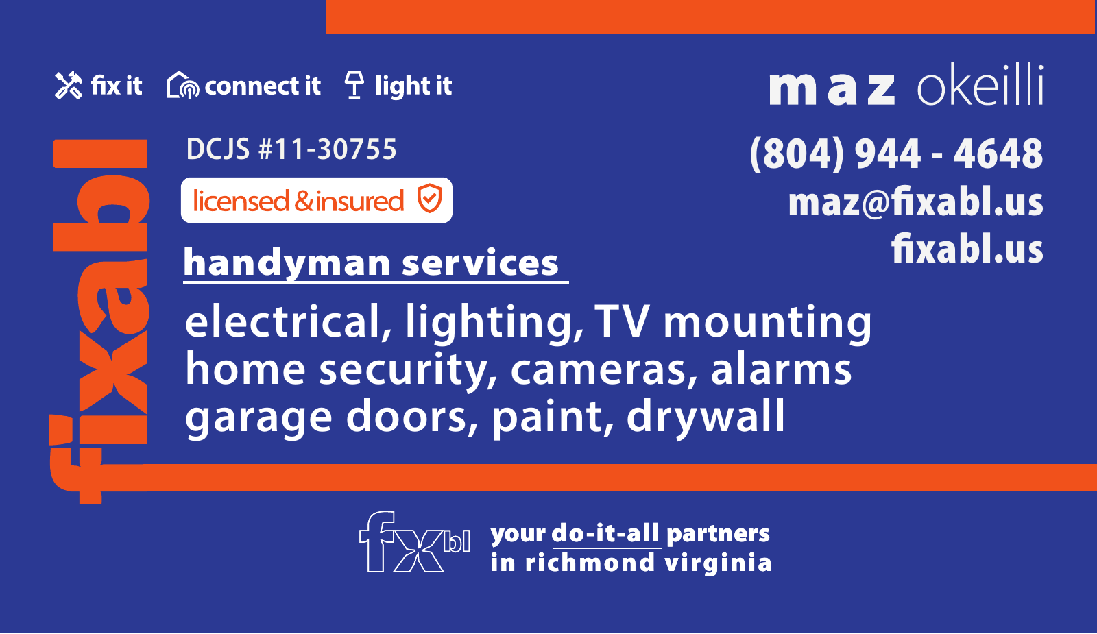
The business card brings the wordmark, service graphics and contact information together. The vertical name and orange rule organize the dense surface, with the outlined compact signature closing the composition.


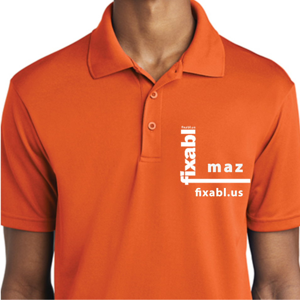
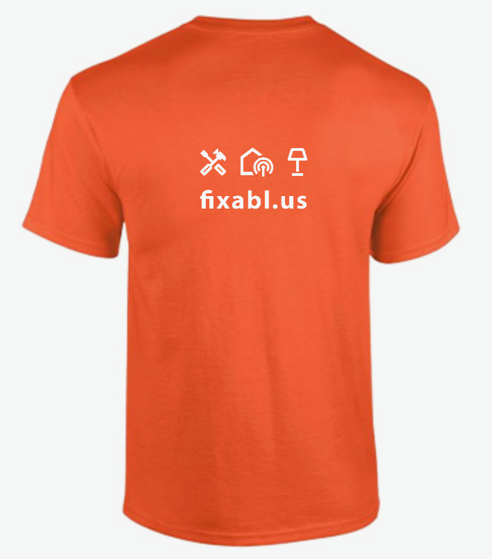
The application studies carry the identity into everyday working settings, adjusting the scale and orientation of the lettering for each surface.
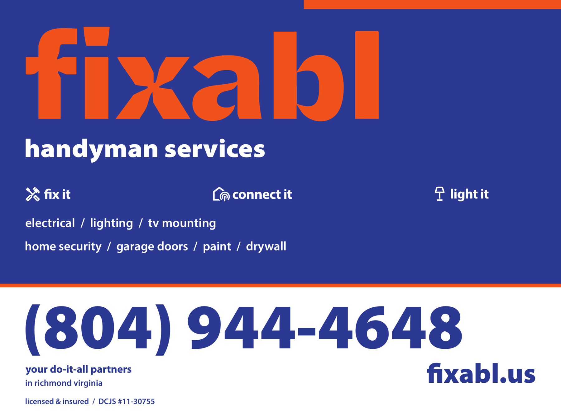
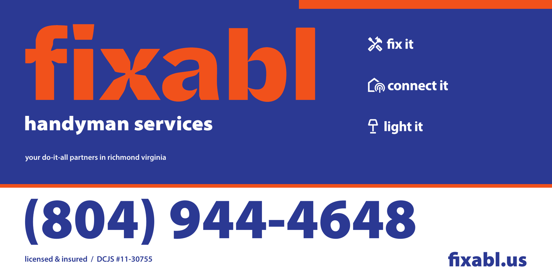
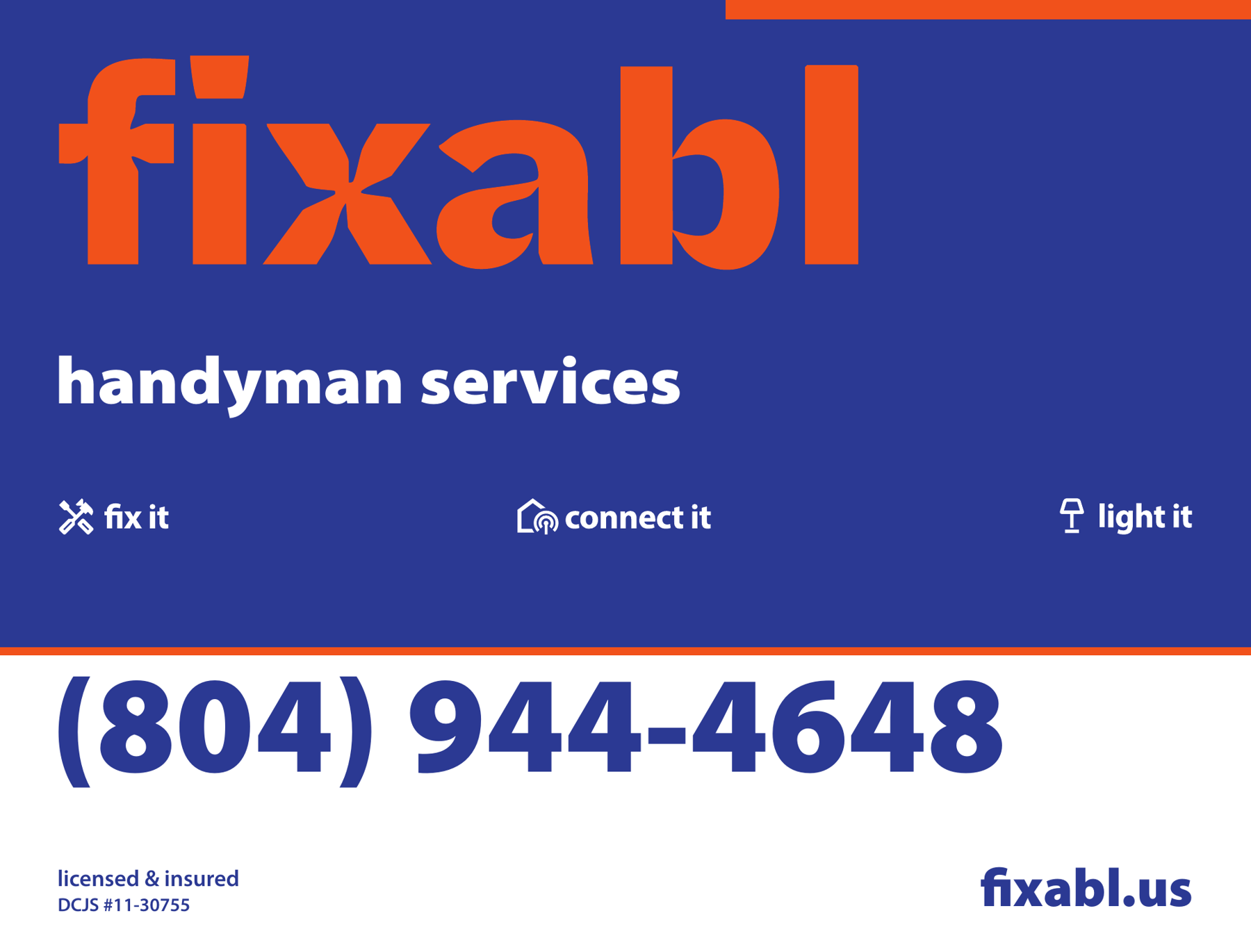
Vehicle magnets and yard signs: Alex + William / Prepared for Mazen.
Garments are shown as mockups; cards, magnets and signs are shown as design artwork. These images document the designs rather than their production or installation.
 View work
Brand direction, visual identity, motion & digital experience
 View work
Campaign leadership, identity, web design & writing