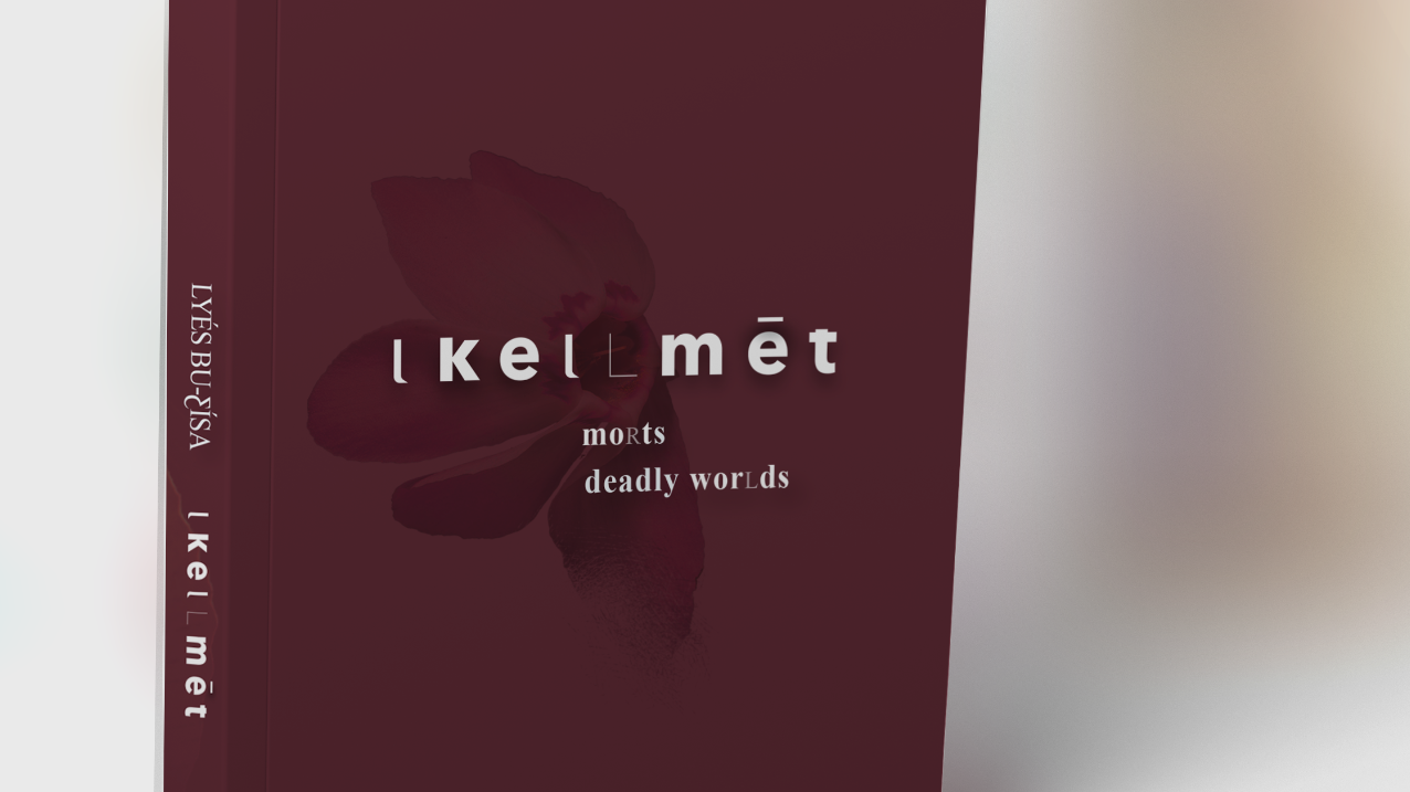
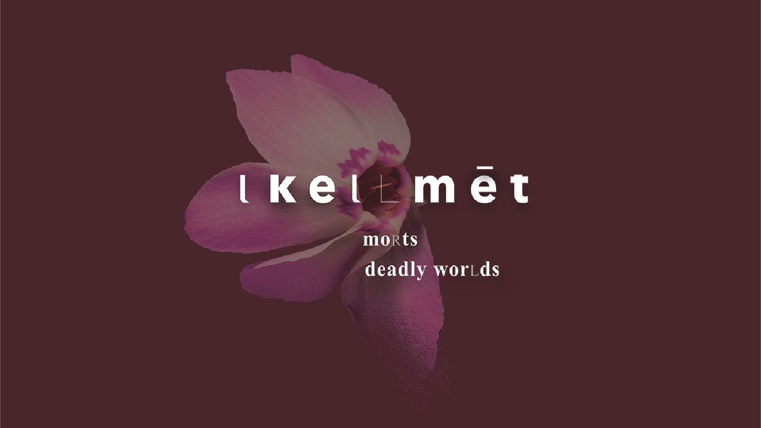
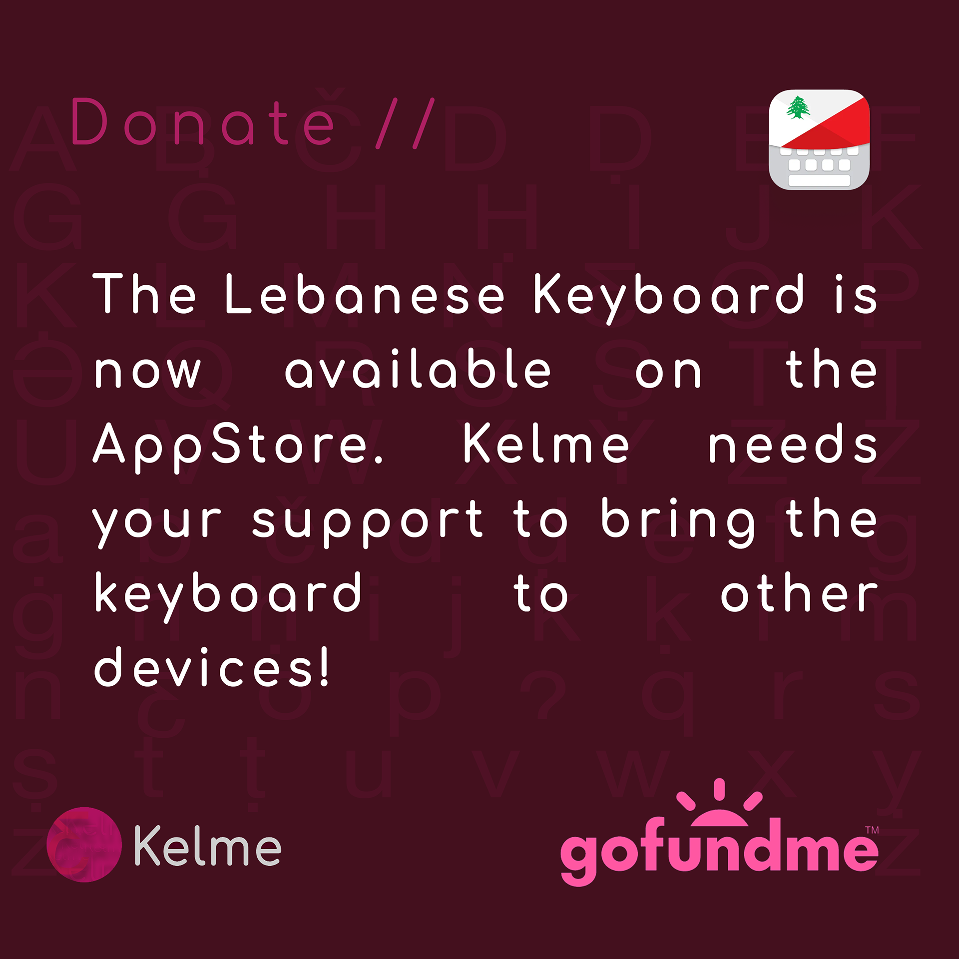
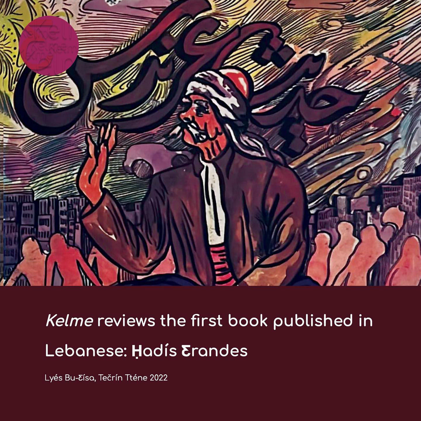
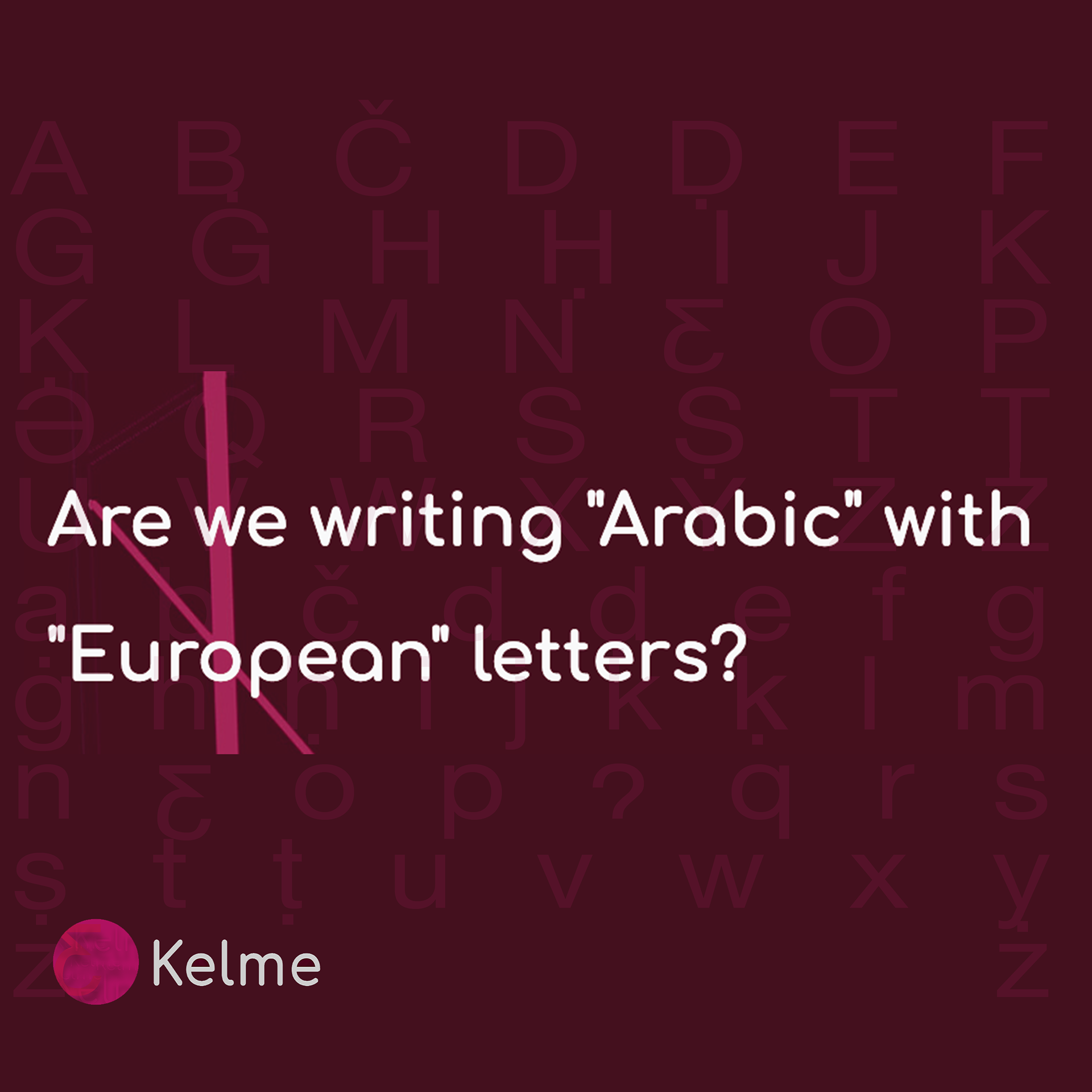


The branding for Kelme embodies its mission to modernize and preserve the heritage and phonetics of the Lebanese dialect. The logo centers on the distinctive letter ƹ—integral to Kelme’s custom keyboard—symbolizing linguistic innovation and cultural authenticity. Encased in a gradient circle, the ƹ reflects fluidity, transitioning from the limitations of “Arabizi” numerals to a script that is both familiar and forward-looking. The pink-to-burgundy gradient evokes modernity while anchoring the design in the historical significance of Lebanese Tyrian red.
The minimalist visual identity extends across Kelme’s branding, combining contemporary sans-serif typography with a deep burgundy palette to evoke cultural depth. Subtle typographic patterns featuring the bespoke alphabet reinforce its linguistic focus, while a modular, accessible design ensures user engagement.
Kelme’s branding seamlessly merges tradition with innovation, establishing it as a visionary advocate for the Lebanese vernacular in the global landscape.